Tuesday 24 December 2013

The New Kitchen - Part 2: The Fitting

 
The units that I had previously assembled were sat into position then levelled and squared up as required.  The handy clamps are great for holding units together whist they are bolted together (cheers James)

 
The sink was a 'two man job' and had to be fitted in place before the worktops, which meant protecting it and a bit of careful working was required. 

 
You can see the wiring for the new sockets in this pic and if you look carefully you can see the pull out corner accessory which allows us to make full use of the previous 'dead space.'  The new wall units are 920mm high, giving an overall height of 2.4m from floor to ceiling, which increases the storage space considerably.


The under unit LED strip lights are also from IKEA and are the same type as the ones we fitted behind the cornice in the living room.


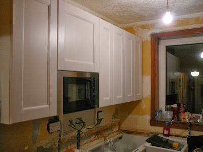
Doors fitted to the wall units and eye level microwave in place.  Still a bit of work to do, but it's starting to look like a kitchen now.


Double oven fitted in a high level larder unit.  This saves anyone having to bend over in the limited space to try get things out of a floor standing oven.  As with the left-hand corner you can see the pull out corner accessory which allows us to make full use of the previous 'dead space.'
 

We chose a double sized Belfast style sink to create a central feature in the narrow kitchen.  The corner pull-out accessories swing round then slide fully out, providing full access to the storage in the corner space.
 
 I have to say that i'm very impressed with the quality of the IKEA kitchen components for the price (e.g. solid wood framed doors, metal framed drawers with 15mm drawer bases and ball bearing drawer runners) and how easy the units and components were to assemble.  The appliances were also very good value for money (particularly with 25% off) with a good range of features on the oven and microwave.
 
I suppose time will tell how good the quality and VFM really is.
 
The kitchen installation is finished (in time for Christmas), but we've still to do the tiling and a wee it of painting and decorating.  Pictures of the fully finished article will be published in the new year. 
 
Have a happy Xmas and New Year and thanks for reading my blog.


The New Kitchen - Part 1: The Strip Out

Finally got round to ordering the new kitchen.  With a Christmas deadline for installation.


We chose an IKEA kitchen and when it was delivered I was pleasantly surprised to find that  every individual package was coded, which made it very easy to check against the order list and easy to keep track of which part goes with which when the units were being assembled. Not one thing was missing.  Well done IKEA.


 Our kitchen certainly isn't the biggest we've ever had, which made it even more important to make the most of the little space we had.  The washing machine was moved downstairs into the utility room to give us more room and open up the 'dead space' corner.


Whilst the kitchen is quite small, the ceilings are quite high, which meant we could go for relatively tall wall units to increase the storage space.  As with the right-hand side corner the left-hand corner was also 'dead space'.


 A final look at the kitchen as it was.


The strip out starts! 
Prior to starting the strip out at the weekend, I had been assembling the new units in another room during the week due to a general lack of space (did I mention that the kitchen is quite small) and to reduce the time we spent without a working kitchen as we were still living at home during the work.


You can see the amount of wasted space in the corner, it's pretty much the size of a whole 600mm unit and apart from poor planning, I don't really know why the previous designer/fitter didn't make use of it.  You can also see the former serving hatch through to the Dining Room..


Well, that's the strip out complete and yes, we did feel it necessary to take down the fake blind/fixed curtain thingy, and no, it won't be going back up.  Next step was for the electrician to come in and re-wire the kitchen, fitting new sockets, appliance isolation switches and upgrading the mains fuse box to take the necessary new 'ring main.'
 
It's amazing how big the room looks when it's empty........Not!

Monday 18 November 2013

Can Ye Tell Whit It Is Yit?

 I had a wee notion to make something out of the various bits of wood that were leftover from other projects
 

A quick brush with undercoat

Pieces to form the integral squares were marked and cut
 
(can ye tell whit it is yit?)
 

A quick coat with the final colour to ensure complete coverage once put together

Here are the pieces being assembled in their final form

Final shape and final coat of paint
Just one more small part to be fitted
 
(can ye tell whit it is yit?)
 
 
.......


.......


.......


.......


A shabby chic lightshade for my daughters bedroom

Sunday 27 October 2013

Dining Room Door Replacement

Following on from replacing the living room door last month, we have now replaced the adjacent living room door with it's matching partner.

The old doors weren't in a particularly bad condition, we just wanted to change them to something that matched our planned décor.

The oak veneered doors which we bought needed to be reduced in width.  The previous door had to be reduced by approx. 3/4" and unfortunately this couldn't be done due to the thin edging strip on these doors, so I had to widen the door frame.  However, this door only had to be reduced by 1/2", so I decided to use my electric plane to take 1/4" off of each edge.

As you can see, there's not much of an edging left after taking 1/4" off.

I fitted the hinges in the workshop before taking the door into the house for hanging.  I'm using three 3" stainless steel ball-bearing hinges on each door because the doors are quite heavy and i'm spacing these to position two in the top half of the door and one in the bottom half (8" up from the bottom).  These should give a smooth action and minimise hinge wear and the finish will also match the handles. 
 
The latch and art deco handles were also fitted in the workshop prior to hanging.  This kept the majority of the mess in the workshop (which is easier to clean up)

and there we have it, the door hung and ready for its 1st coat of varnish.  As before, the door was brushed down to remove dust and then wiped down with a clean cloth soaked in white spirit.

The camera angle is a bit tight, but here are the two doors side by side. The right hand side door has been varnished, the left hand door is ready to be varnished.

First coat of varnish applied.  Before the 2nd coat is applied the door will be gently rubbed down with steel wool then wiped down with white spirit to give a nice smooth finish coat.

Sunday 20 October 2013

A Wee Quickie In the Cupboard!

One of the bedroom cupboards didn't offer much room for storage
 
The cupboard backed onto an area of wasted space above the stairs and I decided to blank off this wasted space and knock the cupboard through to provide more storage.


This may prove just to be a temporary job if the plans for a loft conversion can be progressed.

First step was to frame out the space.  I used some 2" x 1 1/2" leftover from another job.  I also framed out the slope directly over the steps. 

After sheeting the area above the stairs in plasterboard I knocked through from the cupboard and also sheeted the inside of the cupboard in plasterboard to give a finished surface.

Once sheeted the screw holes were filled, ready for a wee rub with sandpaper and eventually a coat of emulsion.

Job completed and the cupboard was promptly filled with a load of kids toys!

Monday 7 October 2013

New Living Room Door

The new living room door getting it's first coat of Ronseal satin varnish.  Prior to varnishing I gave the door a quick rub with fine sandpaper then wiped it down with white spirit to remove the dust and remove any greasy fingerprints or dirty marks.  I've masked off the glazing panels to keep the varnish off of the glass. 

One door hung.  Looks simple in the pics, but it was a lot trickier than it looked.  The oak edging on these doors is only about 5mm thick which really limits how much you can reduce the door by and I required a 12mm reduction.  The only other option, other then renewing the door frames, was to widen the opening.  I used the router for this, but wouldn't want to have to do it again in a hurry. 

A set of Art Deco handles was purchased to match the 'theme' of the room
 
and they polished up nicely.


and there we have it.  A nice new oak door, complete with 2nd coat of varnish which was applied after a gentle rub with steel wool and a wipe down with white spirit. 

Monday 16 September 2013

Living Room - Wallpaper

 
Hanging lining paper on the newly plastered wall to ensure a good surface for the wallpaper.  Using lining paper should limit shrinkage of the wallpaper by slowing down the drying rate of the paste (stopping the plaster sooking all the moisture out of the paste).  As far as I am aware, it doesn't make bumps disappear or improve insulation qualities (as some interwebbers suggest)


Starting to hang the paper on the 3 'plain' walls.  I've heard a lot of people's 'top tips' since I've been DIYing - always start in a corner/never start in a corner/work away from the window/start behind the door, etc. usually followed up by "so that you don't see the joints." However, my experience is that as the paper is being butt jointed (i.e. edge to edge) rather than overlapped you don't see the join from one angle any more than another.  What I tend to do is measure out the rolls and start in a place which means i'll end with the easiest cut (i.e. don't leave yourself a 3 inch wide strip to cut from a full roll and have to fit that round a window).


With the 3 main walls completed it was time to make a start on  the feature wall.  We picked wallpaper by the Art Noveau fashion designer Barbara Hulanicki
 

Hanging this wallpaper required a slightly different planning approach than the 'plain' wallpaper.  As it was the feature wall I started by hanging a central strip of wallpaper and working out in both directions to ensure that the pattern was centred on the wall.


The wallpaper was technically difficult to hang as the pattern was contained on each single strip with no edges to match.  This meant that to keep the pattern level each strip had to be checked with a spirit level to ensure that the pattern was perfectly horizontal.  The alternative option was to offset the pattern, but keeping the pattern perfectly level fitted more with the straight lines of the accompanying Art Deco style of the coving, fireplace, mirror and candle holders.


And there we have it.  Wallpapering complete.  Carpet and curtains next.  Oh, and a lampshade!

Sunday 1 September 2013

Living Room Fireplace

We've purchased a few Art Deco styled items for the Living Room.  It's all coming together now!
 
and here we have the finished article in cream stone effect and metallic grey (still looking for a new carpet).  The double socket will be moved soon to give a more even sided look.


None of the pictures taken really bring out the stone effect of the spray paint, this is the best one


The fire surround was dismantled pretty easily and it's component parts were sanded down, sprayed with a white primer then given two coats of textured spray paint to create a stone effect.

 
The inset fireplace was removed from the surround, dismantled, rubbed down and spray painted metallic grey.  The finish was a bit too matt, but a quick spray of clear lacquer put a bit of a shine on the finished article.
 
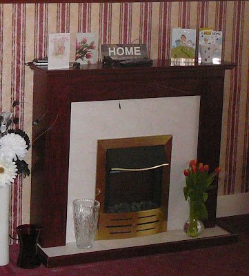
The original fireplace which was here when we moved in.  It was in good condition but the brass and mahogany colour scheme didn't fit with our décor plans, so we decided to keep it and change the colour.